Graphing with ThingsBoard can be a little odd at first, especially when selecting which devices to graph. However it is also a very powerful tool. If you have multiple devices of the same type, you can produce a graph showing all devices of that type, When you add another such device, it will automatically add it to the graph.
In this example we have a number of devices configured, of type ‘RoomTempSensor’, which are sending live telemetry.
Go to dashboards and click + to add a new dashboard. Give it a name and description, then on pressing ‘ok’ you are presented with a blank dashboard. Hit the edit icon in the bottom right to start making changes.
The first thing we notice is the time period is set to ‘Realtime – last minute’. This is useful for an instant status dashboard, but not a historical graph. Click on this heading and in the pulldown either select a preset time period or select advanced to put in a custom one. For temperature graphing, I often find 2 days, 6 hours a reasonable time period.
Graphing single devices
Next we need to select which device or devices we want to graph. Click the Entity Aliases entry, next to the settings cog on the graph control bar at the top. The Alias Name can be any text you want. To graph a single device, select a filter type ‘Entity Name’, select a type of ‘Device’ then an appropriate ‘Name starts with’. Often the full name is the best option to ensure you just have the one device. Also make sure ‘Resolve as multiple entities’ is not selected. A slight annoyance of ThingsBoard is you don’t seem to be able to get a pulldown of device names at this stage or are able to verify that a source has been found for your graph.
Now try adding a graph. Click ‘Add New Widget’ in the middle if no widgets have been added, or select the + icon in the lower right. Select Charts and Timeseries Float. You are presented with a window and requested ‘Please Add DataSource’, click Add. Leave the type as Entity then select your new alias from Entity Alias. Finally select the entity timeseries, to select which telemetry elements you want to graph. Only at this point will you learn if your data sources are correct.
Each data source will be given a default colour, you can change these. See below for more advanced customisation.
Graphing multiple devices
Graphing multiple devices is fairly similar to graphing a single device. Follow the same steps as above to add an Entity alias, only this time select ‘Device type’ as the filter. Under the Device Type menu which appears, you should have a pulldown of your configured device types. Make sure you select ‘Resolve as multiple entities’, and optionally you can filter by device names based on what they start with. Click save when done.
As before, add a new widget and pick a Chart of Timeseries Float. As a datasource, add the Entity Alias you have just created, and add two data series to graph. In my example, I selected temperature and humidity. If it has correctly filtered and located your devices with telemetry, it will list all telemetry keys for all devices, grouping them by key name, e.g. temperature. Leave the settings at default for now, and click ‘Add’.
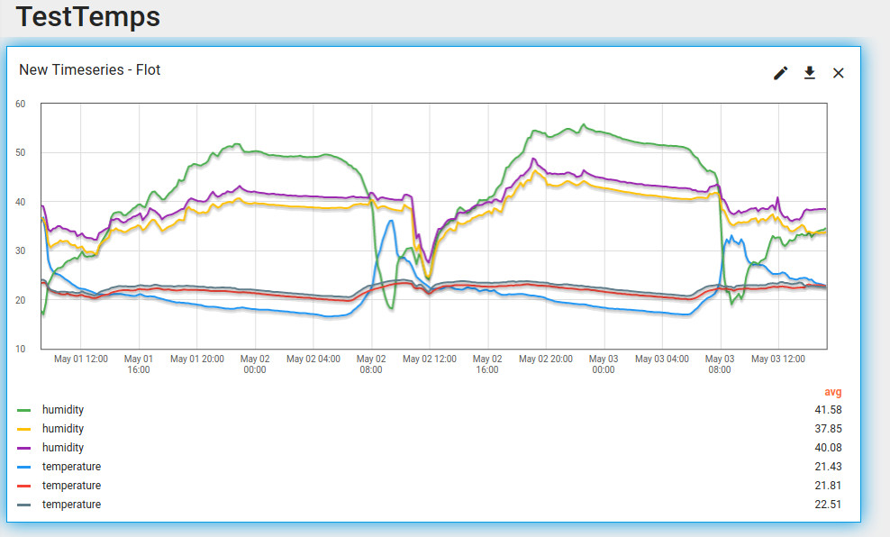
You can drag the graph to a different location or adjust the size, then click on the tick to save it. In my example, it found 3 devices of type RoomTempSensor, then successfully combined Temperature and Humidity on the same axis, as below. But it has listed the key for each data source, meaning temperature and humidity is listed three times each, with no way of knowing which device is which. That is not terribly helpful.
Customising graphs
There are a number of things wrong with the above graph we need to fix:
- There is no identification of the data source
- No units are marked next to the data
- The legend shows the average data, we want average and the latest
- Other cosmetic settings
Identify data sources and setting units
Edit the widget and you will be presented with a screen to select your data source. Click the edit icon next to temperature. Label should be the default key name. Change this to be “${entityName}-Temperature”. While we are on this screen, change the number of digits after the floating point to 2 and the special symbol to show next to the value to °c. While you can change the colour here, this only applies to the first matched data source if multiple data sources are in use. If needed, under advanced, it is possible to set minimum and maximum values on the axis scale.
Do the same for humidity.
This should now label each data series. Other labels can be used. ${aliasName} will give the name of the alias used, but this will be the same for all devices. If you have configured a label for a device, you can use ${entityLabel} . If no label is configured, this will default to entityName.
Changing the legend and cosmetic settings
Edit the graph again and instead of the data tab, go to settings. Set a graph title, and you can edit the CSS for this if you wish. Deselect ‘Drop shadow’. If you don’t want the title, you can disable it completely here. You can set a background colour for the graph, or make this transparent (alpha) to show the background of the entire dashboard.
At the bottom of the main settings tab, there is a blue icon which can control which fields are shown in the legend. I left average then turned on min and max.
A nice feature in Advanced, is the ability to overlay data from another time period (default one month ago) to show a comparison.
The final graph is:
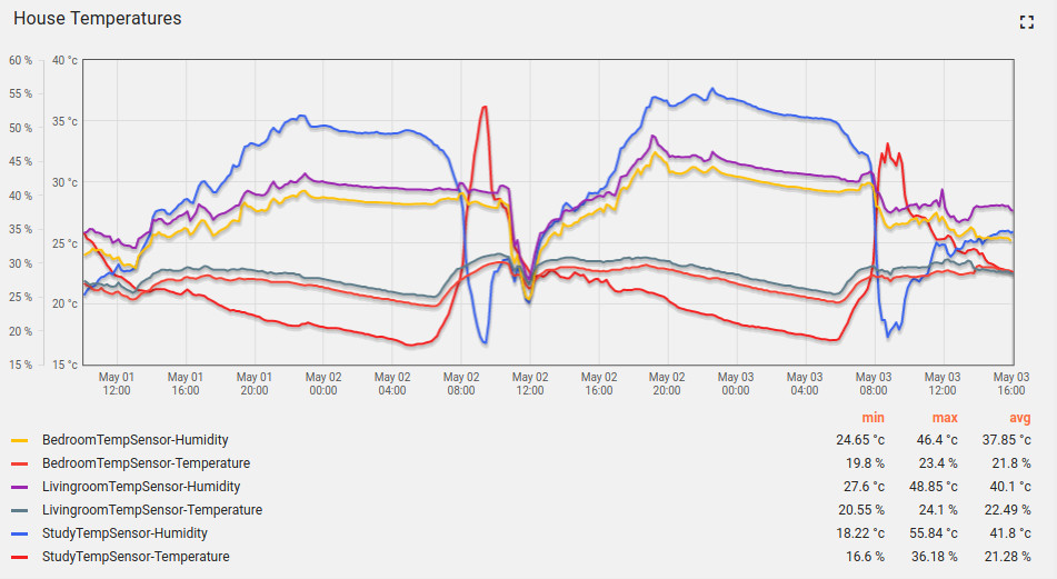
Bug!
Note, the above screenshot was taken from ThingsBoard v3.1.0, which has a bug in the graph legend where symbols on the legend are mixed up. Temperature is now percent where humidity is now in centigrade. When editing a dashboard, the ThingsBoard version can be found in the lower right corner.